
From Functional to Chic: Office Finishes That Impress Clients and Staff
A great office should work hard and look sharp. The best spaces balance durability, comfort, and style so clients feel confident and teams can focus. You do not need a full rebuild to get there. Thoughtful finishes can transform sightlines, acoustics, and touchpoints in a few smart moves.
First impressions start at the door
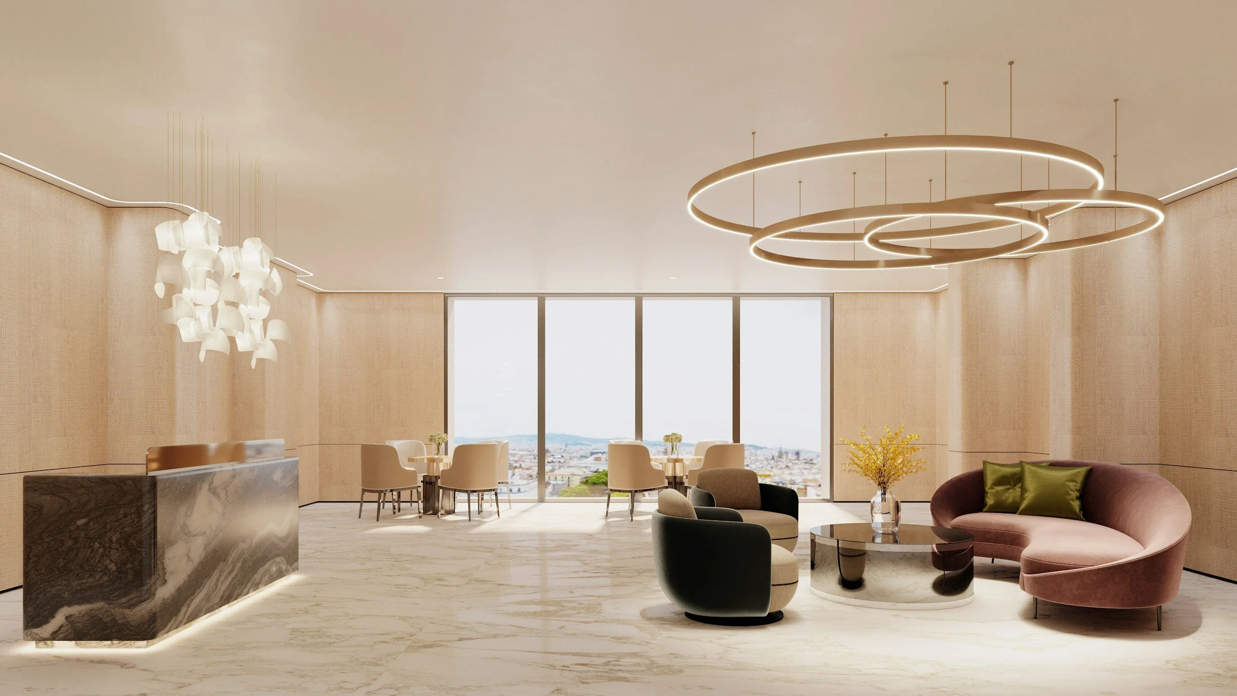
Entry zones set the tone for everything that follows. Choose sturdy flooring with a subtle pattern to hide scuffs and dirt. Add a statement handle and a clean-lined reception desk so the welcome feels intentional.
A tidy entry needs light that reduces glare and shadows. If ceilings are low, keep fixtures shallow and indirect so the space feels taller. Layer in a low-profile rug and a concealed storage bench so bags and parcels do not clutter the line of sight.
Metal finishes that look expensive without trying
Metals anchor the visual language of a workspace and tie hardware to lighting. Try a warm, low-sheen metal that reads refined, like modern brushed nickel for door hardware and task lighting, so the palette stays calm and cohesive, and it will bridge light woods with matte black frames. It pairs well with pale timbers and concrete, and it softens cool daylight so surfaces feel calmer.
Where to use it
Door levers, drawer pulls, and task lamps create a unified rhythm when they match. Keep gloss levels consistent so reflectivity does not compete. In meeting rooms, a thin nickel frame around glass makes sightlines crisp without feeling flashy.
Coordination tips
Repeat the same metal on power outlets, switch plates, and cable grommets so small parts do not distract. If you mix metals, keep one dominant and one accent so the eye has a clear hierarchy. Use textured finishes to hide fingerprints in busy zones.
Lighting that flatters people and materials
Light is the finish you notice first, even if you do not name it. Layer ambient, task, and accent lighting to make colors and textures read true. Pick diffuse lenses and high CRI lamps so faces look natural on video and in person.
Use uplighting to soften ceilings
Add under-shelf task lights at workstations
Specify warm to neutral color temperature for collaboration zones
Dim where screens dominate to cut glare
Good, modern lighting should also support wayfinding. Highlight thresholds, circulation paths, and key signage with subtle accents. Keep emergency lighting coordinated with the main scheme so it does not feel like an afterthought.
Acoustic comfort that actually works
Noise is the fastest way to make a polished office feel chaotic. A peer-reviewed study reported that adding controlled background sound made nearby speech less intelligible and therefore less distracting, which supports the case for well-tuned sound masking alongside absorbent surfaces. This approach lets open areas stay social without turning into echo chambers.
Balance absorption and diffusion so rooms do not feel dull. Soft ceilings, felt baffles, and fabric-wrapped panels absorb energy, while bookshelves and slatted timber scatter it. Keep mechanical systems quiet with lined ducts and flexible connectors so the sound floor stays consistent.
Practical do-overs
Start with a quick acoustic audit and map noisy paths. Treat the ceiling first, since it has the most area and the least visual clutter. Add wall panels at first reflection points where chatter bounces most.
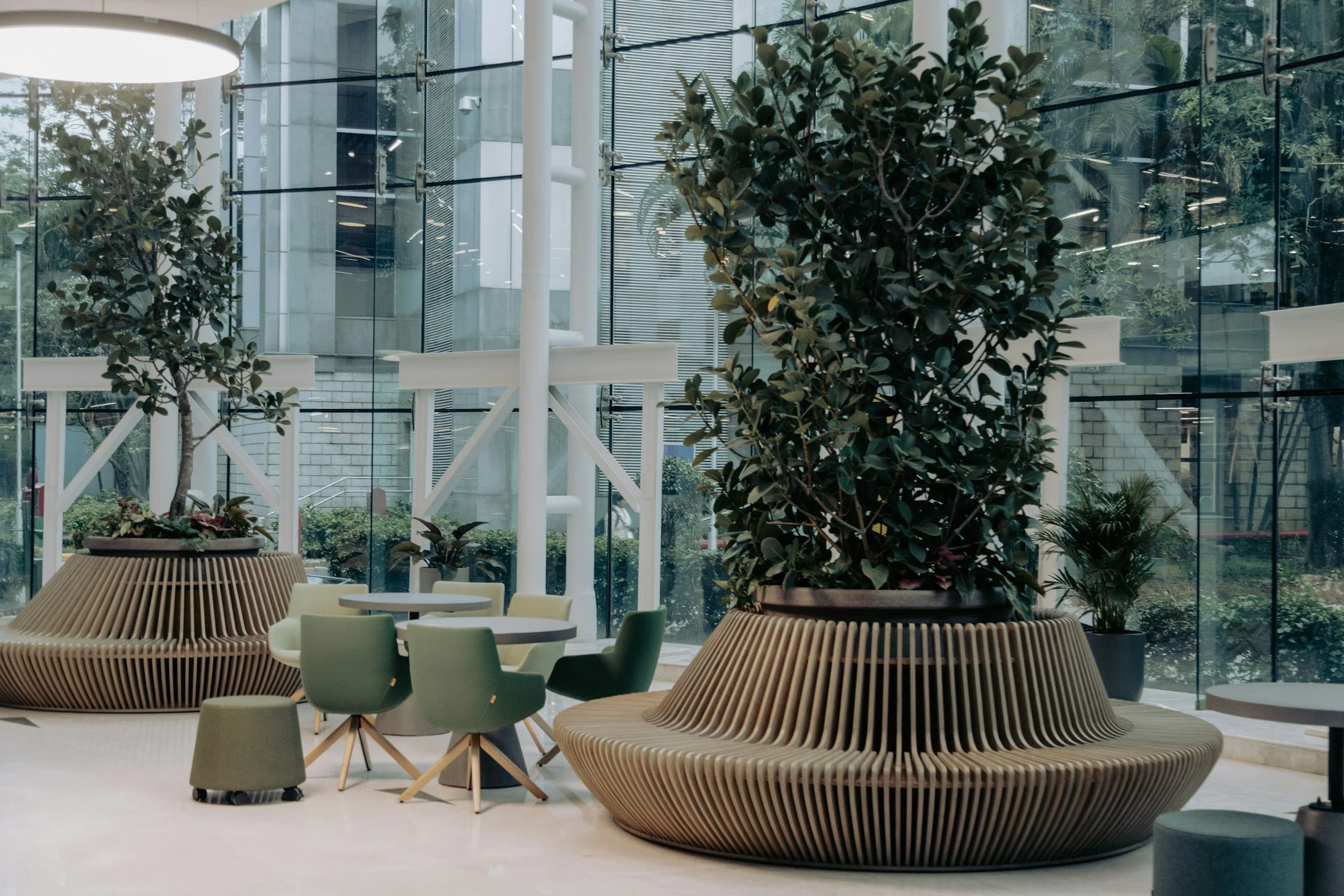
Focus zones and pods that earn their footprint
Private space is a finish choice too, because pods and booths are wrapped in fabric, glass, and metal that affect what you see and hear. One workplace feature noted that acoustic pods can lower stress and mental fatigue by cutting noise, which helps people finish tasks faster without leaving the floor. Pick units with replaceable panels and leveled feet so they sit cleanly on hard floors and carpet tiles.
Pods work best as part of a gradient. Offer phone boxes for quick calls, 2-person rooms for pairing, and small meeting nooks with soft seating for decompression. Face entries toward natural light and away from busy aisles so users feel secure.
What to check before you buy
Door swing and clearance in narrow corridors
Ventilation rate and fan noise
Power access and cable routing
Glass thickness and privacy film options
Ceilings and walls that do more than look good
Overhead planes are prime real estate for performance. Trend roundups in commercial interiors emphasize sculpted baffles, perforated patterns, and integrated lighting as part of a broader push toward wellness and productivity. That means statement ceilings can be both beautiful and measurably useful.
On walls, consider a mix of absorbent and durable surfaces. Felt tiles and cork pin-up zones invite quick collaboration, while high-abrasion coatings stand up to chairs and carts. In boardrooms, a microperforated timber wall gives warmth while quietly reducing echo.
Smart specifications
Choose panels with a clear NRC rating and match suspension colors to nearby fixtures. For baffles, confirm fire ratings and maintenance access above the ceiling line. Use simple geometries repeated at different scales so the look feels intentional, not busy.
Flooring that handles traffic and keeps its cool
Flooring sets the acoustic and visual baseline for the entire office. In high-traffic zones, use dense carpet tiles for sound absorption and easy replacement. In entries and kitchens, choose resilient surfaces that resist water and abrasion so the finish stays fresh.
Patterns should be practical. A small-scale texture hides crumbs and wear without reading as busy. Transition strips and flush thresholds reduce tripping hazards and make cleaning faster.
Zoning with pattern and pile
Use a tighter pile for circulation paths and a softer pile for heads-down areas. Switch to a woven vinyl or rubber surface in wet zones, then return to carpet for open offices. Keep color shifts subtle so the plan reads as one space.
Texture, color, and plants for a calmer vibe
Clients read the room fast. Soft textures and grounded colors lower visual noise and make detail work shine. Bring in plants with matte planters to break up long sightlines and to soften glass edges.
Color should support people, not dominate them. Mid-tone woods keep metal accents from feeling harsh, and desaturated greens and blues promote focus. Reserve bold hues for small moments like door reveals, art frames, or stool bases.
Quick palette tips
Limit base colors to two, then let metal and timber do the rest. Repeat one patterned material three times across the space to create rhythm without clutter. If you introduce a saturated color, repeat it in at least two more places so it feels deliberate.
When metals, lighting, acoustics, and textures work in concert, your office space looks chic and functions even better. Clients notice the polish. Teams feel supported. And your finishes keep earning their keep day after day.