
Designing for Impact: Marketing Materials That Convert
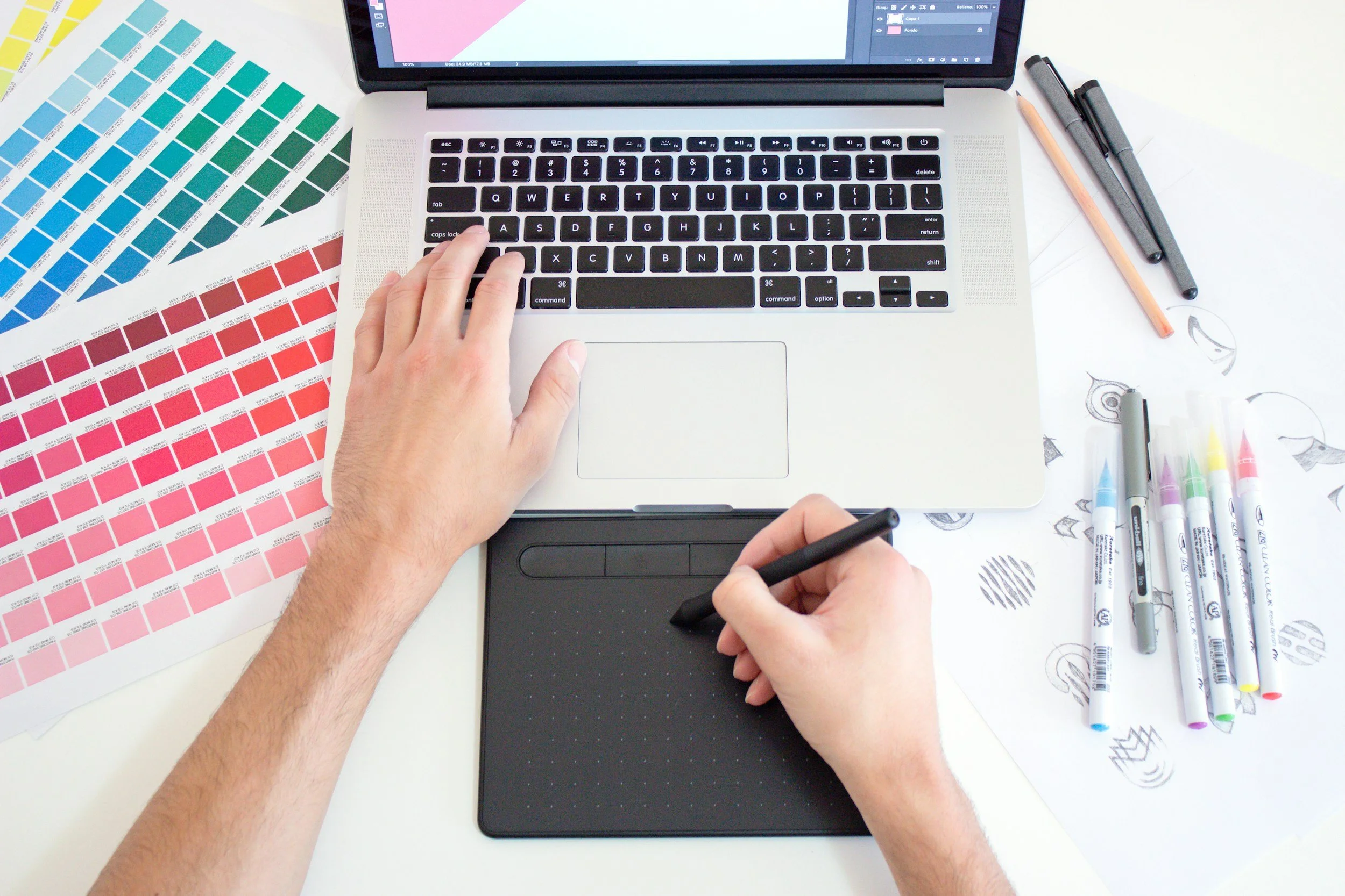
Every piece of marketing you create is a chance to tell your brand's story and connect with potential customers. From a simple business card to a detailed brochure, these physical items act as your silent salesperson long after a meeting ends. But just looking good isn't enough. They need to be designed to make an impact, guiding your audience toward a specific action. Effective marketing materials don't just inform; they convert.
This process blends psychology, design strategy, and clear communication. When you get it right, your flyers, postcards, and other print assets become powerful tools for growing your business. Let's explore how to design marketing materials that truly get results.
Understand Your Target Audience
Before you even think about colors or fonts, you need a crystal-clear picture of who you're trying to reach. Designing without your audience in mind is like shouting into an empty room. Your message will get lost because it isn't made for the people who need to hear it. Start by creating a detailed customer profile. What problems do they face? What motivates them? What kind of style do they like?
A design that speaks to a young, tech-savvy startup founder will look very different from one that appeals to a retiree looking for financial planning. Your audience's demographics, values, and preferences should guide every design choice, from the images you use to the words you write. This crucial first step makes sure your materials feel relevant and speak directly to what your ideal client needs.
Principles of Effective Design
Good design isn't just about looking nice; it's about communicating clearly. To create materials that convert, you need to follow a few key principles that direct the viewer's eye and make your message easy to understand. These conversion design principles help create a smooth experience for your audience.
Visual Hierarchy: Arrange elements to show what's most important. The most critical information, like your headline or offer, should stand out the most. Use size, color, and placement to draw attention where you want it.
White Space: Don't be afraid of empty areas. Cluttered designs are overwhelming and hard to read. White space gives your content room to breathe, making it easier to read and giving it a more professional, polished look.
Brand Consistency: Your marketing materials should instantly be recognizable as yours. Use your brand's colors, fonts, and logo the same way across everything. This builds trust and strengthens your brand identity.
Readability: Pick clean, easy-to-read fonts and make sure there's enough contrast between your text and the background. Your message is useless if people can't easily read it.
Choosing the Right Materials
The physical feel of your marketing materials can subtly influence how people see your brand. A flimsy, thin piece of paper might suggest a cheap or low-quality brand, while thick, sturdy cardstock conveys professionalism and value. The texture and weight of your materials are part of the overall brand experience you're creating. Think about the impression you want to leave.
For networking events, where first impressions are everything, investing in quality really matters. Unique options like thick, sturdy painted-edge business cards can make you memorable among a sea of standard cards. The unexpected pop of color on the side creates a talking point and shows incredible attention to detail. For a mailer, you might choose a glossy finish to make your images stand out. The material itself becomes part of the message, reinforcing your brand's quality and positioning.
Call to Action That Gets Results
Every single piece of marketing material needs a clear purpose. What do you want the person holding it to do next? Without a strong Call to Action (CTA), your beautiful design is just a piece of art. Your CTA should be specific, compelling, and easy to find. Vague instructions like "Learn More" are less effective than direct commands like "Scan to Book Your Free Consultation" or "Visit Our Website for 20% Off."
Put your CTA in a prominent spot where it can't be missed. Use a contrasting color or a button-like shape to make it stand out. The same logic applies to both physical and digital items. In fact, many successful conversion-centered design strategies for email can be adapted for print. The goal is to remove any obstacles and make it incredibly simple for your audience to take the next step, which is crucial for effective property sales.
Test, Measure, and Optimize
Designing for conversion isn't a one-time thing. It's an ongoing process of tweaking and improving. The only way to know what truly works is to test different approaches and measure the results. This might sound complicated for print materials, but there are simple ways to do it. For example, you can create two versions of a flyer with different headlines or CTAs (an A/B test).
Use unique QR codes, custom landing page URLs, or distinct discount codes for each version. Track which one gets more scans, visits, or sales. Did Flyer A with the "Get 15% Off" offer do better than Flyer B with "Schedule a Free Demo"? This data is incredibly valuable. It takes away the guesswork and lets you make decisions based on facts, constantly improving how effective your marketing spend is and making sure your materials are always optimized for the best possible results.
Designing for impact means being thoughtful about every element. By focusing on your audience, using solid design principles, and constantly testing your approach, you can create marketing materials that do more than just look nice; they actively help your business grow.