

Image Credit: Unsplash
Are customers leaving your store without buying everything they intended, struggling to find products, or abandoning purchases because shopping feels inconvenient? Poor aisle flow, confusing displays, and inadequate cart capacity can quietly reduce sales while frustrating shoppers. Discover how smarter retail store layout strategies, better product placement, and customer-focused improvements can create a smoother shopping experience, encourage larger purchases, and increase store profitability.
Mapping the Shopper Journey
Start by mapping the route customers actually take, not the route shown on the original floor plan. Watch where people pause, reverse direction, abandon a display, or ask an employee for help. Heat-mapping tools can provide useful data, but a manager with a floor plan and a clipboard can identify many of the same recurring patterns over several busy and quiet periods. Observing these physical movements directly helps you address customer friction before these operational bottlenecks lead to lost sales and frustrated shoppers.
A good map marks entrances, decision points, congested areas, and sections that receive little traffic. Pay particular attention to the first few yards inside the entrance. Customers need space to adjust to the store, locate signs, and decide where to go. Crowding this area with promotions can make products less visible because people are still getting oriented.
A practical retail store layout strategy connects high-demand departments with logical secondary purchases. A grocery customer heading for pasta, for example, may appreciate sauces and grated cheese nearby. An office supply customer buying a printer may need paper within the same part of the store. These connections should feel helpful, not random.
Record recurring obstacles as customer frustrations, then use the framework in this guide to remove your customers’ pain points. If ten people each hour stop to search for checkout signs, the signage needs attention. If customers repeatedly leave a bulky product behind, carrying capacity may be the real problem.
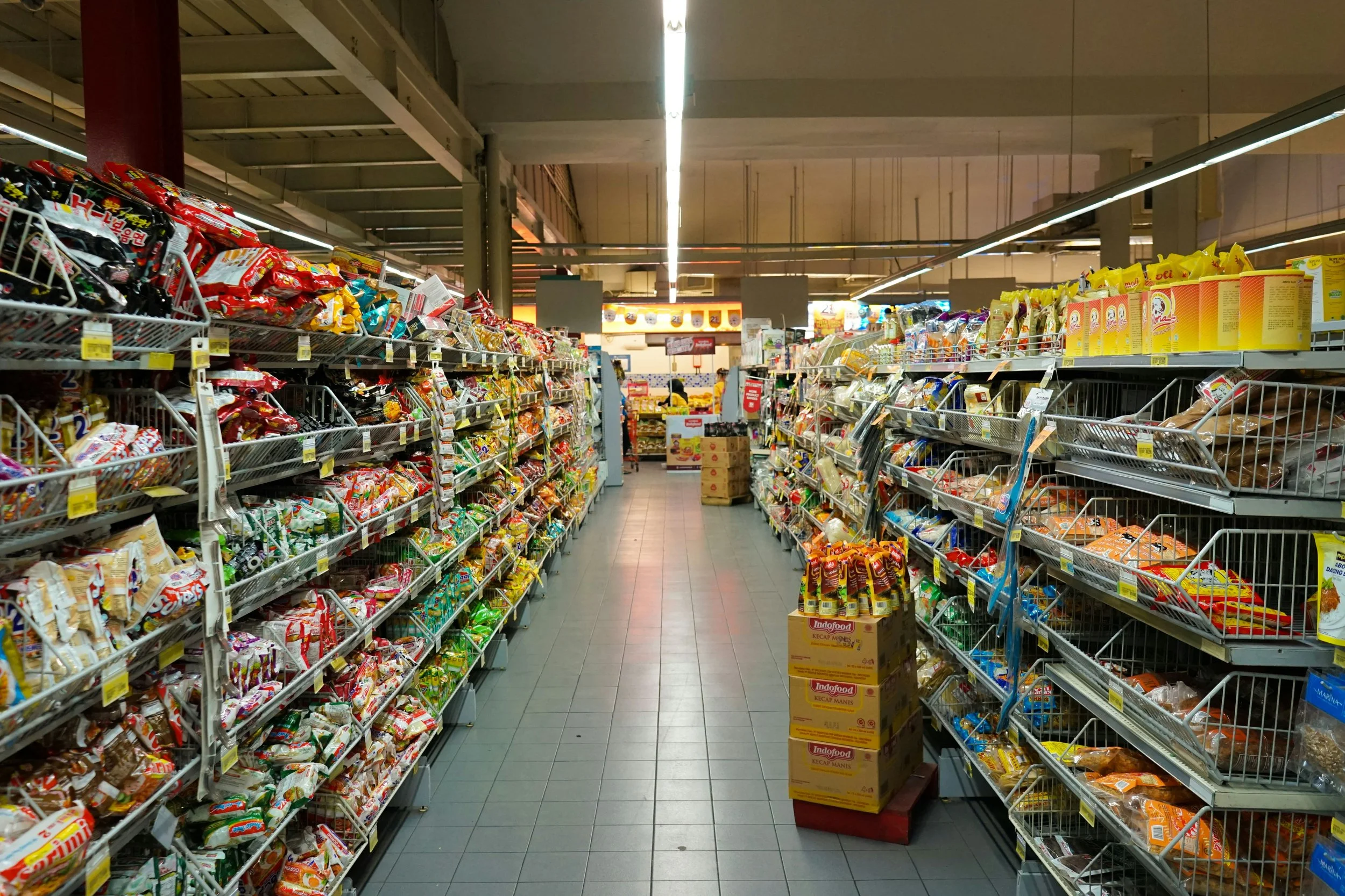
Image Credit: Unsplash
Remove the Burden of Heavy Items
Customers often limit purchases for a physical reason: carrying another item feels inconvenient. A handbasket that becomes uncomfortable after three or four products creates an unplanned spending limit. The same issue appears when carts are too small, difficult to steer, or unavailable near a secondary entrance.
Match carrying equipment to the products and typical visit length. Convenience stores may need compact baskets near several points, while supermarkets and cash-and-carry outlets benefit from commercial shopping trolleys that can accommodate larger trips. Position them where customers make the decision to shop, including entrances connected to parking areas. A neat supply of carts also signals that the store is ready for high-volume purchases.
Maintenance matters as much as capacity. A wheel that pulls sideways makes every aisle feel narrower, while damaged child seats and rough handles discourage use. Set a weekly inspection routine that checks wheels, frames, handles, and nesting. Remove faulty units immediately instead of leaving customers to discover the problem.
Think about the moment when shoppers realize they need more capacity. Place a basket exchange point or a small cart bay near the transition from quick-purchase departments to heavier categories. Staff can also offer a cart when they see someone struggling. This simple service prevents customers from abandoning products because their hands are full.
Measure average units per transaction before and after the change. If basket size rises while visit duration stays stable, easier carrying is likely helping customers complete more of their intended purchases.
Aisle Flow and Visual Merchandising
Aisle width should reflect both traffic and browsing behavior. A narrow aisle may work for products selected quickly, but categories that require label reading or comparison need more room. Customers who stop to examine packaging shouldn’t block everyone behind them. The ADA accessibility standards for sales areas also provide a useful starting point for clear routes, even when local requirements differ.
Look for pinch points created by promotional bins, freestanding signs, and stock waiting to be shelved. Move or remove anything that forces two carts into a single-file line. Endcaps should remain visible from a distance and leave enough turning space at aisle intersections. When customers can change direction easily, they’re more likely to explore another department.
Visual merchandising works best when it helps people make a decision. Group products by use, place bestsellers where customers can find them, and use adjacent displays for genuine complements. A display of pasta bowls near pasta and sauce provides a recognizable connection. Mixing unrelated clearance items into the same space creates visual noise.
Shelf position also affects what shoppers notice. The consumer eye-tracking research on retail shelves shows why visibility, placement, and package recognition deserve attention. Give profitable or strategically important products clear visual space, while keeping essential items easy to locate.
Review signs from a customer’s eye level. Category names should be readable before someone enters the aisle. Use consistent wording across overhead signs, shelf labels, and store maps so customers don’t have to interpret three different names for the same department.
Test Layouts Before Scaling
Treat each layout adjustment as a small business experiment. Choose one measurable problem, make one defined change, and compare performance over a reasonable period. Moving several departments, changing signs, and launching a promotion at once may produce a sales lift, but you won’t know which action caused it.
Begin with a baseline that covers at least two comparable trading periods. Record average transaction value, units per transaction, department sales, and conversion rate if door-counting data is available. Include operational measures such as restocking time and checkout queues. A layout that lifts sales but creates constant bottlenecks may need refinement before wider use.
Test a new fixture or product grouping in one representative area. Keep pricing and promotions consistent where possible, then review the results after enough normal traffic has passed through. The basic principles of controlled business experiments can help teams separate a genuine improvement from ordinary weekly variation. Seasonal events, pay cycles, and local activity should be noted alongside the numbers.
Customer and employee feedback adds context to the data. Ask short, specific questions such as “Was this category easy to find?” or “Where did carts become difficult to move?” Floor employees often spot repeated hesitation long before it appears in a monthly report.
Once a change works in one area, repeat it in a second location or department before approving a broader rollout. Document fixture positions, aisle measurements, sign wording, and the dates of the test so the result can be recreated accurately.
The clearest sign of a successful layout is often simple: customers complete a larger shop without spending extra time searching or carrying more than is comfortable. Track that combination, and the store will reveal which subtle shifts deserve to stay.